


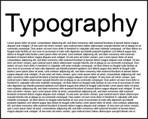
The Do’s and Don’ts of Font
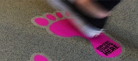
When it comes to your labels, window stickers or your floor stickers you want to make sure that they get your specific message across. When choosing typography you want to make sure that they are legible, noticeable and complement the design perfectly; here are a few handy tips from us at Customark:
Fewer fonts make more impact
Using more than 2 fonts can make any design look too cluttered and hard to read; we find that sticking with a bold design for the main attraction and then a simple type of typography for anything else makes the design look cleaner.
Font types
The most common forms of fonts are Serif and San Serif. Serif fonts include little embellishments (serifs) at the end of each stroke (Bookman Old Style, Georgia, Times New Roman). San Serif (meaning “without serif”) fonts are the ones without (Calibri, Arial, Gill Sans). Serif fonts like Times New Roman are seen as more traditional, whereas San Serif fonts like Arial are seen as more modern.

Serif

San Serif
You can also use Handwritten and Script fonts for effect. Using them sparingly is always the way to go and avoid using them with large bodies of text as it can become very illegible and quite cramped very easy.

Good example of handwritten / script

Bad example of handwritten / script, depending on the situation
Size
Getting the size right with text is very important; too small and it can become hard to read but too big can also overpower and outbalance your design.
Tracking, Kerning and Leading
Tracking is the spacing between each letter of one work, too small and it can blur into one; too much and it can become too spaced out and hard to read. Kerning is sometimes confused with Tracking as they are both to do with spacing, but instead of one word it is between two letters. Set too closely together, letters are unclear; set too far apart and they are awkward to read. Leading is the spacing vertically in lines, so between the lines in a paragraph. Like Tracking and Kerning getting the balance right is crucial for the legibility of the text.
Tracking:
This is where will change if you adjust the Tracking
This is Tracking being too close together. It will make words merge into one
This is an example of the Tracking being too far apart, depending on the situation this can be used and look quite modern and presentable
Kerning:

This shows where you will find Kerning

This is when the Kerning between two letters is too close together, as you can see certain letters do become hard to read

Having the Kerning too far apart can make words look too spaced and awkward to read
Leading:

Here shows you where Leading is in a paragraph

This is an example of Leading being reduced too much

Making the leading too wide can make reading paragraphs very frustrating
Colour
There are many things to think about when choosing colours. What is your background colour? Will it clash? Will it blend in too much? Is it too bright? Who is your audience? Are they affected by colours like colour blindness or are they partially sighted?

A simple black and white theme is always a safe choice

People with sight problems will have a hard time reading this coloured font on a bright background

If you have a bright background like yellow a dark coloured font we find is best as it stands out

Picking a colour that is too close to your background colour can affect the legibility

This is a good example of fonts standing out on your background colour
What space you have to work with
If you have got limited space to work with you do not want to overfill it with text and risk compromising the legibility of the writing, make sure you think realistically with the sizing and the amount of information you want on it.

The amount of text has not affected the readability or legibility
The first thing you notice about this example is that there is too much text and it is far too small. Here we would try to minimize the amount of text on the graphic
We hope you found our Typography tips helpful; remember for any design advice we have an in house Artwork department to help with any questions.
Call:01384 264700 or email: sales@customark.co.uk